Continuing from my previous post about making simple diagrams, here’s a follow up set of tips and information to give you the confidence to present your ideas and knowledge visually.
When to make a diagram
Only make a diagram when you need one. I am not a big fan of work for works sake, and will avoid it until it’s clear there’s a need. So before you pick up your pencil, ask yourself why this diagram must exist?
Some reasons a diagram might need to exist
-
To help you think, or visualise a problem,
-
to help you communicate an idea or concept to someone else,
-
to help you confirm your understanding, or ensure alignment of understanding with someone else.
Some reasons a diagram shouldn’t exist
-
A methodology or approach says it should,
-
someone with power says it should (without any other good reason).
Ask, is this better than the status quo?
The status quo is whatever your context prefers as a communication medium. Is a diagram going to do a better job of explanation than a well written sentence, a table of figures, a short-form video clip? Replace with whatever the status quo of your industry might be. Making a diagram is work, more work that simply writing or explaining the content with words. If your diagram isn’t doing a better job than the status quo, ditch your diagram.
Adding dimensions
You can introduce a second dimension to your diagram (the first, space, is there by default) such as time, or sequence, by using some well known conventions such as numbering (communicates a sequence) or a left-to-right (or opposite, depending on your cultural context) device, such as used in a service map or blueprint. Beware though, adding a dimension to a diagram is a destructive act. Meaning…
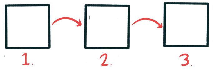
Once added, you can’t remove dimensions.
If your diagram needs a time dimension (eg. this thing happens before this thing and after this thing) your whole diagram now has a time dimension. You can’t remove a dimension after you’ve added it, and you can’t really have the dimension only apply to one part of your diagram.

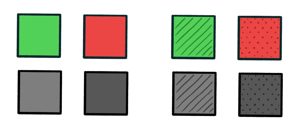
Design your diagrams inclusively
Avoid excluding members of your audience by making accessible diagrams. Using colour alone as a signifier will exclude people with colour blindness. Overcrowded or noisy diagrams will exclude neurodiverse people. Sum up your diagram in alt text when its published on the web. If you don’t understand the needs of your audience then make effort to, or follow established guidelines from a reputable source.
Respect the conventions of your context
That’s just a wanky way of saying: know who your audience is, and know where your diagram will be published. If you’re making a diagram for electrical engineers, respect the conventions of their diagrams by either avoiding common conventions entirely, or adopting them.
If your diagram will be published with others, collaborate with the other creators to ensure you’re not confusing each others’ audiences by stumbling into each other’s visual language. If you can, adhere to a shared visual language.
End of part two
Next time I’ll present some diagramming quirks and hard-learned lessons to help make sure you don’t repeat my mistakes. Read it now!