Recently a colleague asked me to give them a 101 on how I make diagrams. I wrote out a few pages of thoughts to prepare for our one hour session, and think it might be useful for others too. So here it is for all to enjoy.
Principles
Combine simple shapes
Use simple familiar shapes – squares, triangles, circles and lines. These are your basic components of a drawing and you should never need more.
Be deliberate
Make deliberate choices. There are no wrong choices, but every choice should be explainable. In a diagram everything means something, even if that’s not your intention, so know why you are choosing a circle to represent a person and a square to represent an organisation. Know why you chose a dashed line over a solid line to communicate a connection.
Consistency
Be consistent. Stick with your conventions in the same diagram or related set of diagrams. If a circle is a person then it must always be a person. You can vary circles to vary the kind of person, but your audience will build their understanding to read that a triangle probably isn’t a person in your diagram.
Reduction
Two simple diagrams are better than one complex diagram. Your diagrams should communicate one thing. How things in the system relate. How components in this network communicate. If your diagram is more complex than a simple sentence that’s a clue that the diagram you’re making is too complex. Make two diagrams.
Avoid embellishments or choices based on aesthetics
Avoid illustrative features like characters, speech bubbles or illustrative representations of objects (eg trees). The complexity they add isn’t worth the work. Similarly avoid drop shadows or other meaningless embellishments unless they are there for a very specific reason (see ‘be deliberate’),
Test your diagrams
Know what a diagram is for, then put it in front of other humans and ask them to explain it to you, change your diagram until you’re happy it can be read correctly by most people. Pity my wife who has to deal with being constantly asked to look at my doodles and explain them back to me.
Basic components
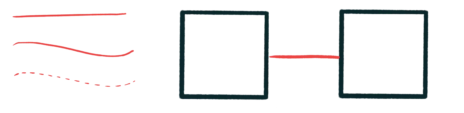
Lines
Lines show connections. Dotted lines show less confident, or less direct connections. Dashed lines draw different kinds of connections. Lines that stop suddenly show disconnections. Straight lines are confident and reliable, wavy lines are humanist and organic.
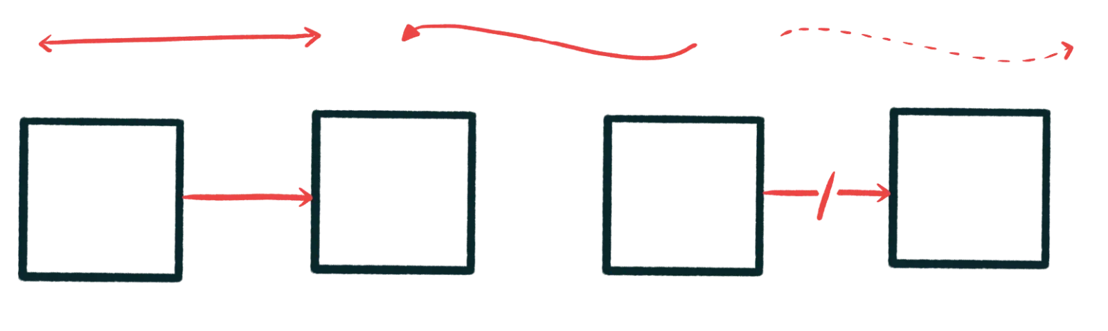
Arrows
Arrows added to a line shows direction. This talks to that. This depends on the existence of that. Direction is subjective, so go with your subjective gut, but be consistent. Arrows that point in both directions are a sign of complexity in your diagram, think carefully before you use them, consider using two lines with single arrows instead.
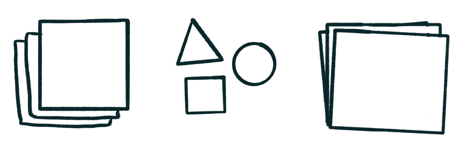
Shapes
Use simple shapes to represent things. A square is a thing, a triangle is a different thing, a circle is a third, different thing. In my diagrams shapes are the primary differentiator between things. Vary colour, texture, border or other qualities between the same shape to show minor differences. But remember, change the shape: change the thing.


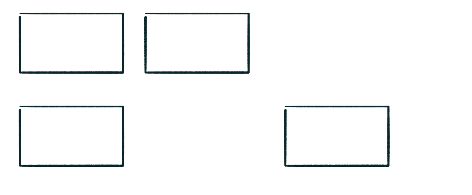
Stacks
Stacks are collections. A stack of the same shape is a collection of things that are the same, a stack of different things is a collection of different things. Stacks on top of each other show order and stacks in a jumble show disorder. Choose your stack wisely.
Labels
Label things. Labels explain how to read your diagram. Don’t overuse them but err on the side of explanation over intuition. Keep labels short. If you diagram feels like it needs more explanation than simple labels can provide:
-
Put an explanation under your diagram in the form of a sentence or two, or
-
Simplify your diagram.
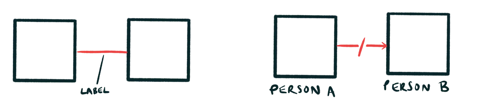
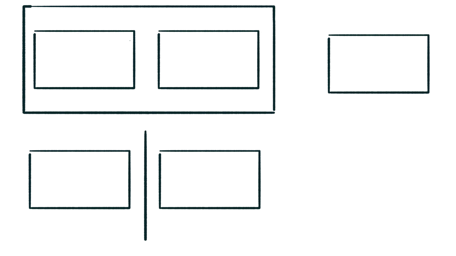
Relationships
Use proximity to communicate relationships. Placing things close together shows they are probably related , and placing things far apart shows they aren’t related or are less related (relatively. Sometimes you’re creating relationships because of relations you’ve built in your diagram by accident. More on that conundrum next time…).
Things in the same box are related more strongly than things outside the box. Things with a line between them are unrelated or even deliberately separated.
End of part one
Part two will come next week, in which I’ll elaborate on some of the above, show you how to bring it all together, and introduce some more advanced diagramming concepts.