We’re back for a third and final part of my series about diagrams. Here we discuss a couple of quirks to watch out for, how to get started with a diagram and why having a good time making a diagram doesn’t mean you made a good diagram. Here for the first time? Start at part one.
Some quirks to watch out for
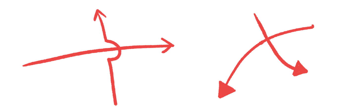
Lines that cross or jump other lines.
I’ve not found a way to make this readable or understandable in a diagram. Don’t expect a consistent or predictable response from your audience with lines crossing or jumping. Redraw your diagram from scratch to minimise jumps and crosses if necessary to avoid this phenomenon. Don’t rely on jumps or crosses to communicate anything. The human brain is weird, most people will completely tune out the crossing or interactions of lines. I think this might be a behaviour where we’ve learned to tolerate the artefacts of inflexible graphics software.
Arrowheads
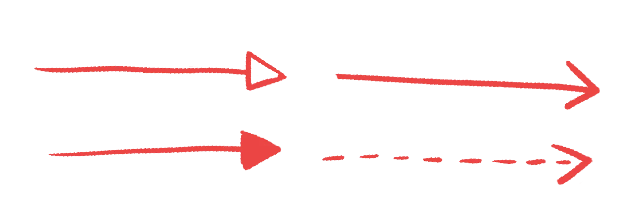
in some visual languages arrowheads types are very important (for example, in the software engineering Unified Modeling Language (UML) diagrams) . Stick with one kind of arrowhead unless you intend to add meaning with a variation. But: in testing i’ve noticed some people will not read a difference between different arrowheads, so i wouldn’t rely on this as a universal concept.
Deal with both of these quirks by following my tip in part one: Test your diagrams
Don’t confuse the good making of a diagram with the making of a good diagram
I see this all the time, where a couple of people have got together and over the course of a few hours or days cracked the problem of representing their problem in a diagram. Their hopeful faces, their dramatic retelling of the process, building up to the moment they put it in front of other people and it looks like a spiderweb of complexity.
There’s a different between a productive process, whereby the making of a diagram helps the participants understand something, through the process of making the diagram and the making of a diagram that helps people on the outside understand something.
Getting these two things confused is extremely typical, especially in my area of work, design consulting, where lots of energy is put into the making of artefacts. I’m pretty sure this is how we ended up with system maps. Fun to make, exhausting to try and understand.
Making a diagram
I’ve tried and failed half a dozen times now to write up a process that a cautious beginner might find helpful, from starting with nouns to give you shapes, and verbs to give you connections, to writing out a sentence and slowly replacing word combinations with doodles. I couldn’t arrive at a solution that made sense so I’m just going to say this.
To make a diagram, start by drawing. Use whatever medium feels the most comfortable to you - for me that’s pencil and paper, sometimes Miro. Stick to simple shapes and lines, use labels and explanation where you think might be necessary. Iterate as many times as you want and test your diagram with its intended audience. No big reveals here.
And finally, it’s a cliche but have fun. Mess around and enjoy the process. Learn a new skill and share your progress with the world.
Further reading
Many of the concepts that will help you in diagramming (and any other creative pursuit) can be found in the book Universal Principles of Design.
I have not read it cover to cover but many people recommend MITs A Primer of Visual Literacy.
If you really catch the bug and want dig deeper into visual communication, then Scott Mcclouds’s Understanding Comics is a great read and many of the concepts he presents apply to any medium.