Higher Education
The University of Oxford
Helping the oldest university in the world use design to meet the changing expectations of students, faculty and funders.
The problem
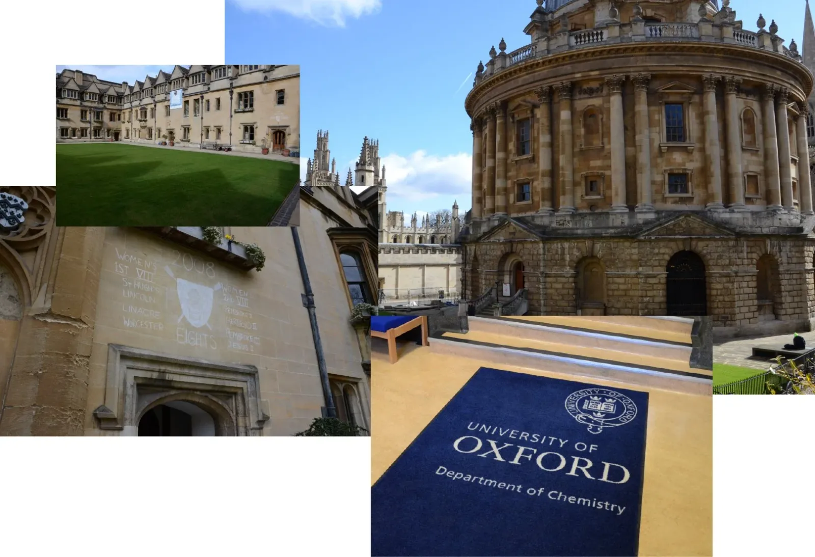
Oxford, a university over 1200 years old, had no problem getting applications, but they wanted to make sure they were getting the right applicants, helping them build an equitable, diverse student population. With access to financial support and grants in place to do that, the website needed to reflect the open doors.
What I did
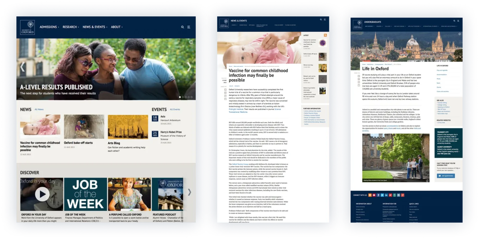
I was the design lead for the initial portion of the project, what we called design and discovery, researching and building a picture of the audience and their needs, then establishing the principles, design language, visuals, and user experience that would set the project up for success over a sustained delivery period. I set up the processes and standards which the project would continue to use throughout the multi-year project.
Design principles
Inspired by the research we began the design project by gathering the stakeholders and codesigning and ratifying a set of Oxford’s own design principles.
This was a key moment in the project as it allowed us to build consensus on the concept, before we moved into solutions.
“…life at the University should come bursting through in every page and piece of content, reflecting Oxford’s unique character.”
“…great content keeps interested users coming back and engages disinterested users. Great design helps the content to do this.”
Bringing the client along
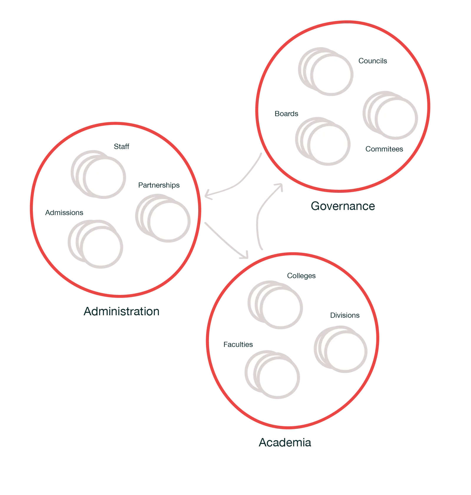
Looking after the stakeholders on any project is always high on my agenda - but on Oxford this was more important than ever. The university has been around for a millennia, and has all the organisational complexity you’d imagine. Colleges and ‘the university’ being separate institutions, separate academic and administrative hierarchies, then departments, faculties, schools and other satellite organisations. Keeping everyone updated on the project, and making sure everyone’s needs were taken into account was challenging.
We made sure that all our ideas and decisions were based on a solid rationale, backed up with evidence, testing, aligning to our strategic vision, and adhering to our design principles. Design in a large organisation with so many stakeholders is about compromise, you can’t make everyone happy, but you can make sure everyone has had their say and are able to understand how and why decisions are made, and that was our goal throughout the project.
Key moments
User testing
As with every great design the testing was key, from the beginning of the project the users of the website were part of testing and feedback processes, both by us, and with Bunnyfoot, UX testing specialists. The website went through many iterations to make sure it met the needs of a vast wide-ranging group of users, and was verified through user testing throughout.
Prototyping in code
Being able to support a massive range of device types was paramount to meeting the needs of Oxfords’ website users. The expectation that their phone, tablet, laptop or games console should be able to work equally well was evident. We built this into the project from day one, starting with making designs in HTML and CSS, ready to be tested and viewed from any device. This allowed us to see how design decisions would affect the widest range of users, taking into account different screen sizes, input methods, and network conditions.
Painting in new colours
Research told us that the university’s reputation as an ancient institution wasn’t necessarily seen as positive from all audiences, and the strict rules around the use of colour reinforced what some users described as ‘fusty’. We challenged these conventions by using a wider colour palette in certain situations, going outside the conventional blue and gold, where it made sense.
The results
The new website launched in 2014 and continues to be extended and iterated on to this day. In 2015 and 2016 it was awarded the accolade of Higher Education Website of the Year.
Nearly a decade on, the Oxford website is still using the design language and visual look and feel I put together, a testament to the success of the design and the investment being returned many times over.